
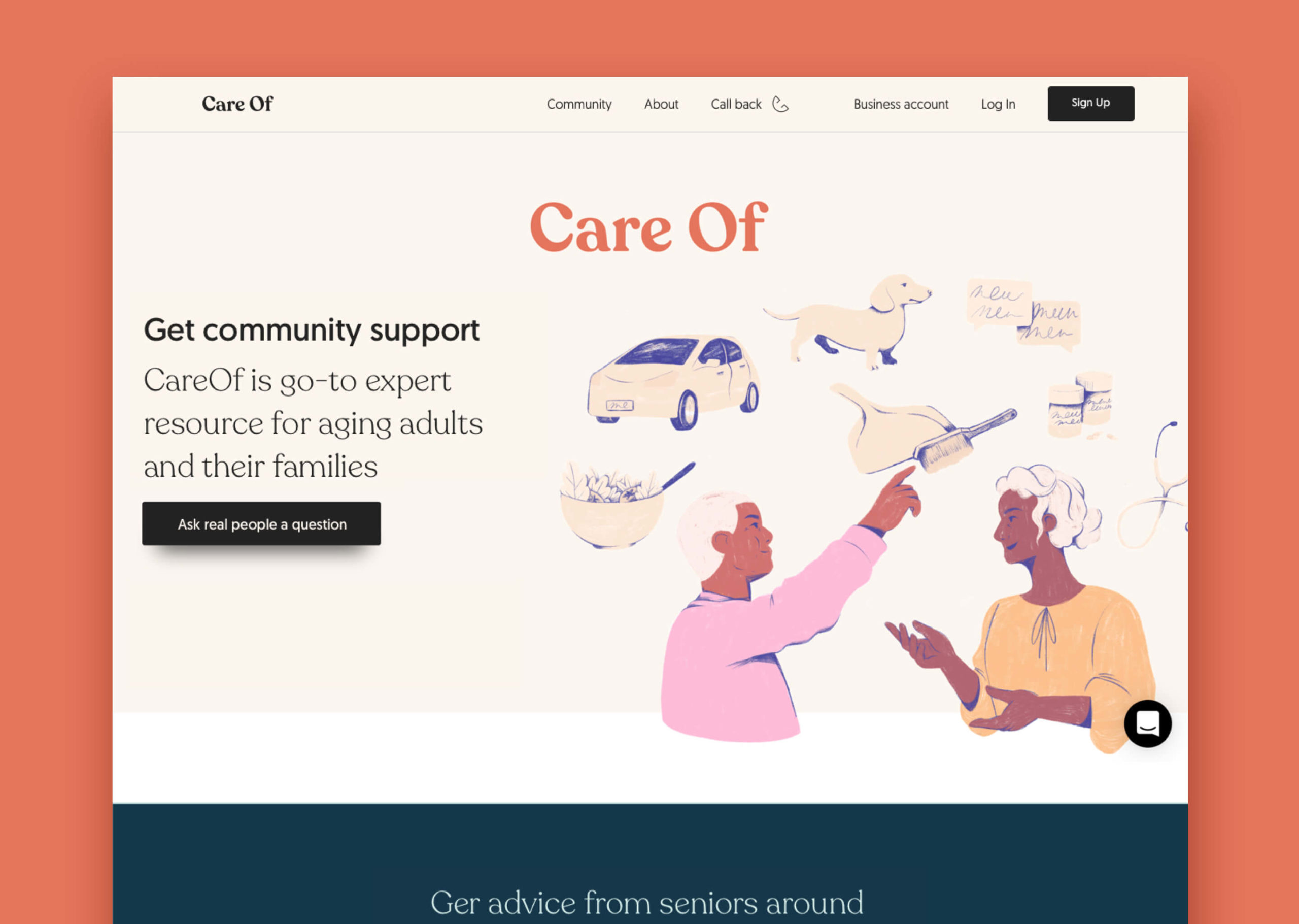
Care Of – expert resource for ageing adults and home care
About
In January 2020, I started working for an audience I never working before – ageing people. Many of them are suffering from lack of information, transperency and professionality in Australia market.
- Role UX designer
- Platform Web application, Landing page
- Link careof.com.au/
- Length 3 month part-time
Problem
Seniors requiring home care suffer from the market’s non-transparency and immaturity. There is no way for them to choose a home care provider wisely, considering the experience of other people.
Solution
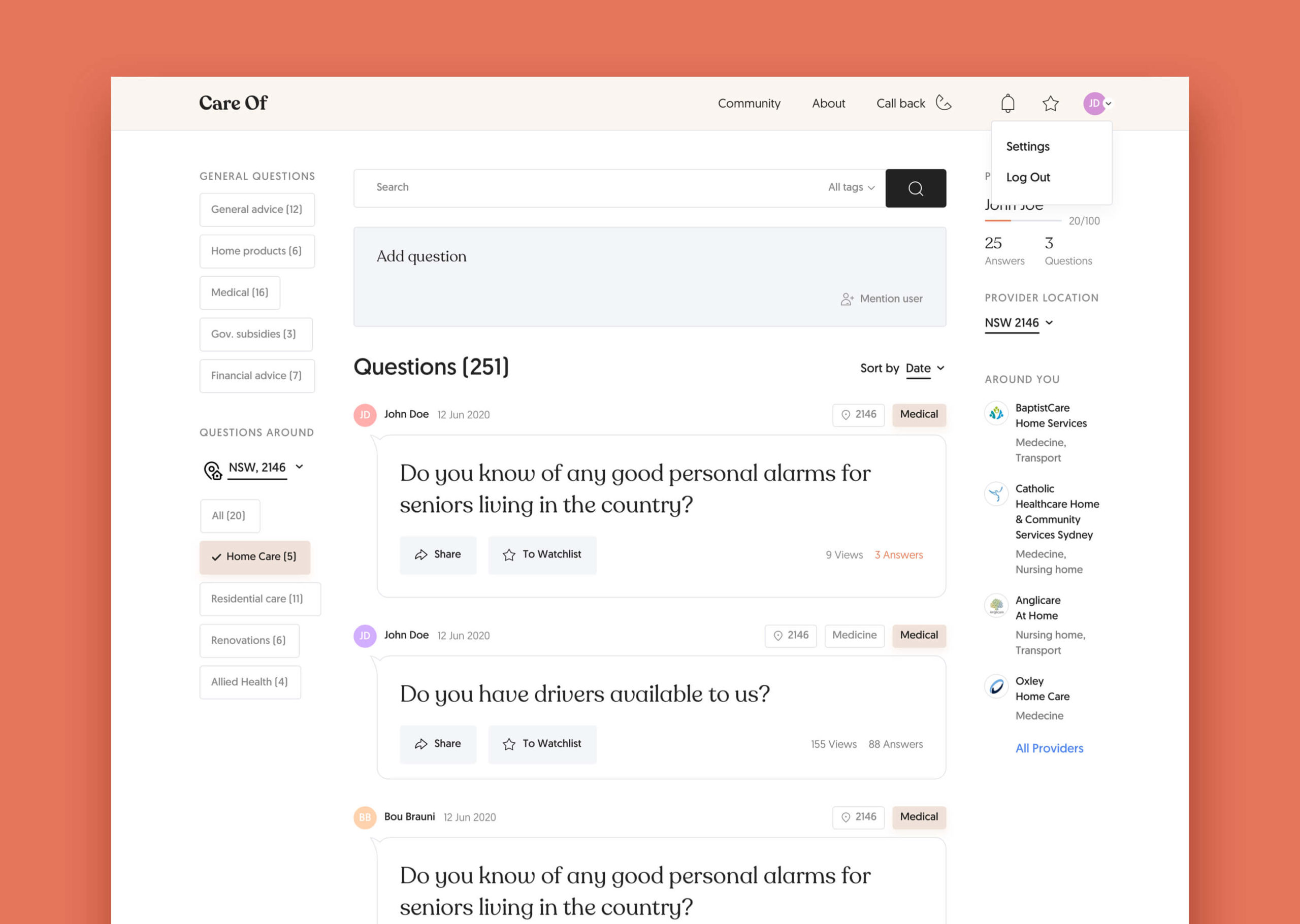
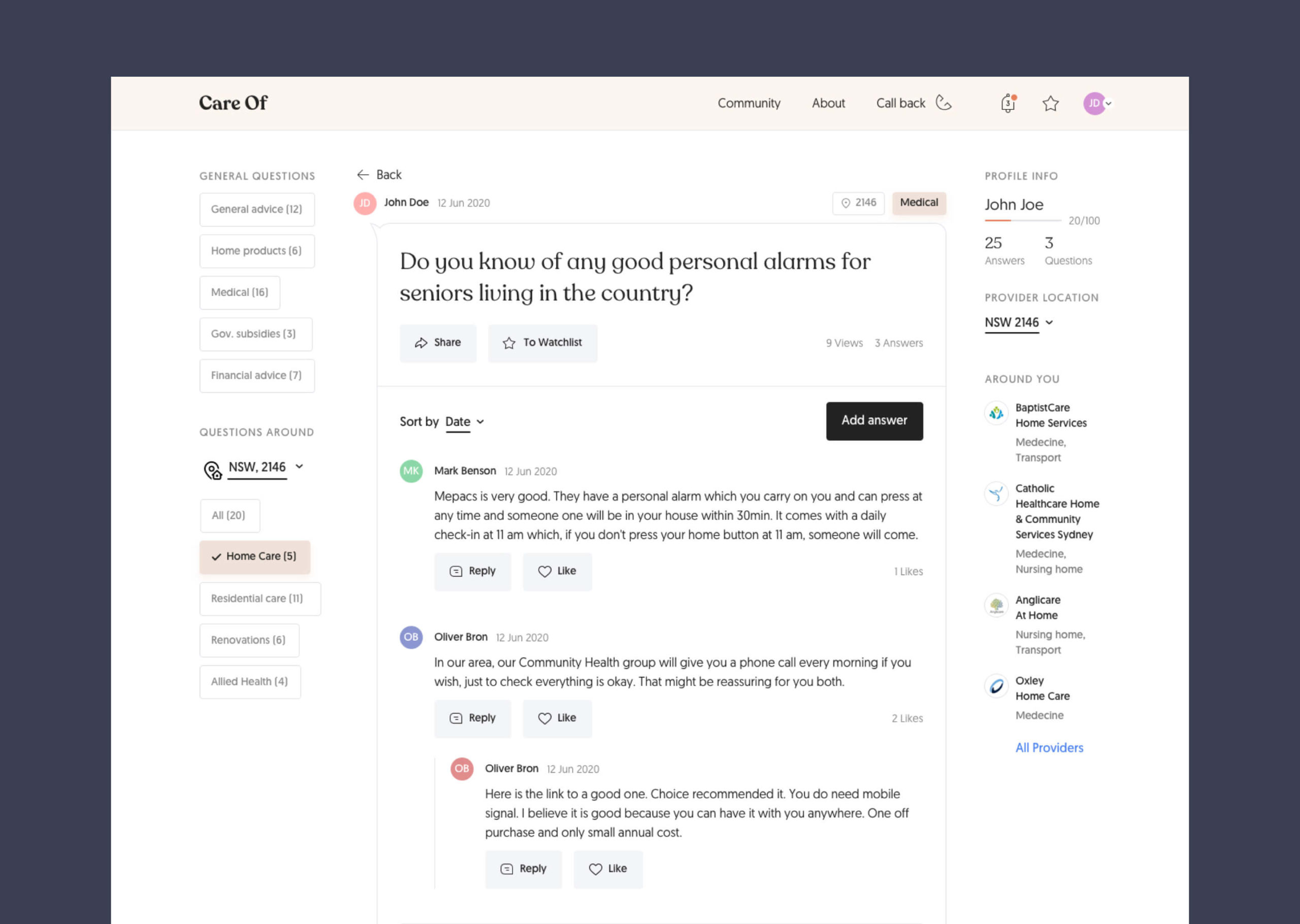
CareOf platform is a go-to expert resource for ageing adults and home care. A platform allows seniors and their families asking and receiving questions about home care, providers and legal issues.

The main challenge
A platform for a generation that it is barely using computers can be tricky. A user needsto receive honest info about home care providers on the local market without struggles.

User Stories
User stories – are short, simple descriptions of a feature told from the perspective of the person who desires the new capability, usually a user or customer of the system.
It helped me and client better empathize with the target groups and think about scenarious we have not thougth about before.
3 main roles were defined:
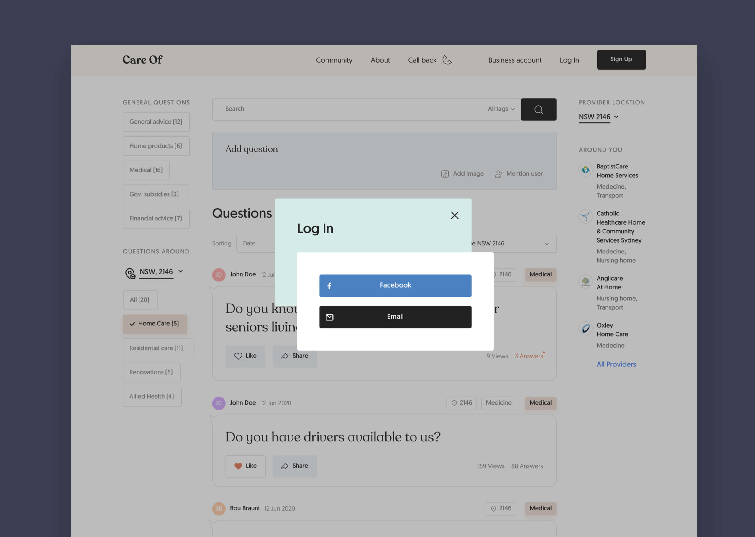
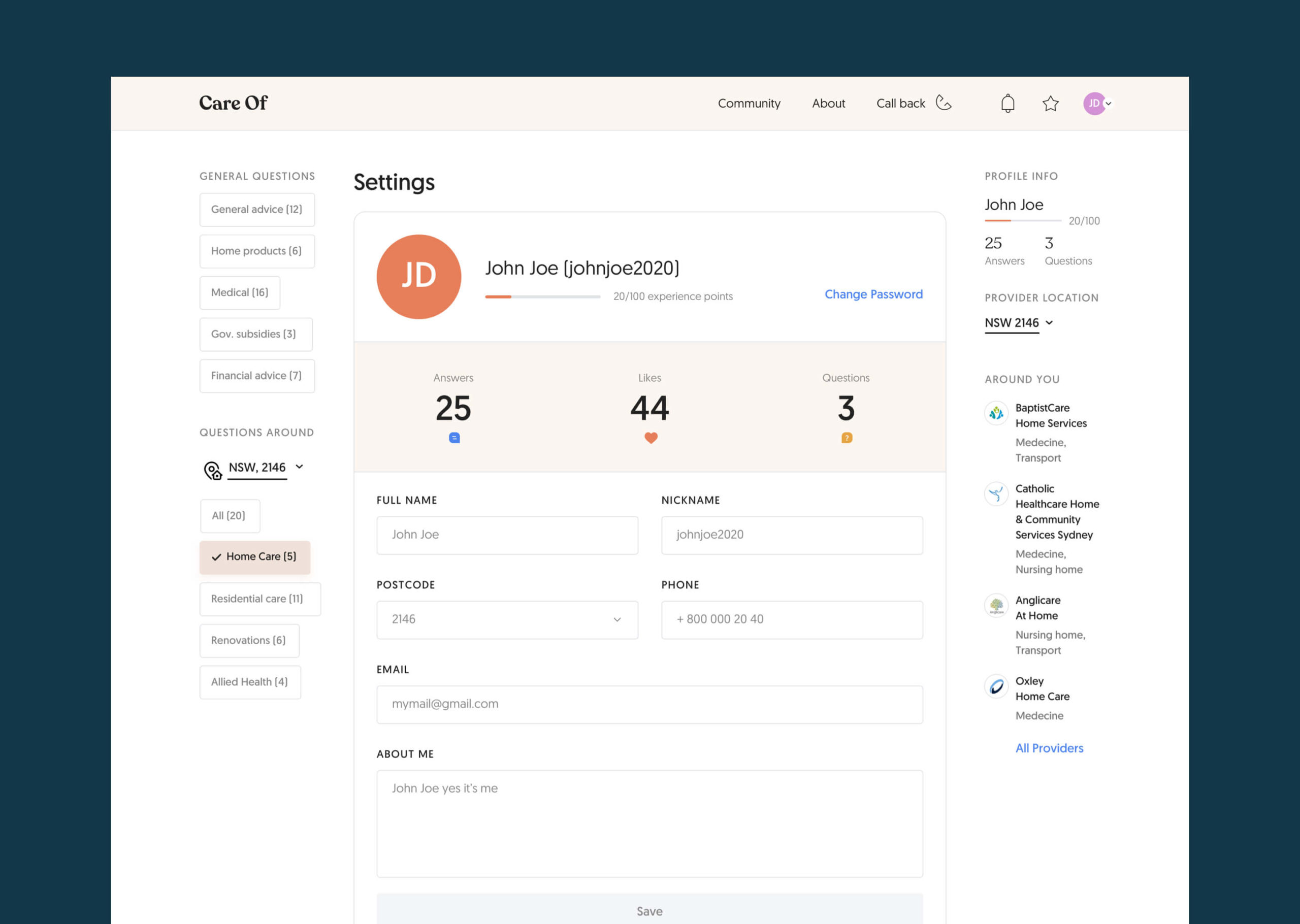
USER – is a senior or a family member (people 50-80 y.o.) who helps a parent with home care provider. A user doesn’t like sites where user has to log in. A user knows how ti use Facebook.
Business owner – is a representative of home care provider. Business owner answers relevant questions and promote a brand of a provider.
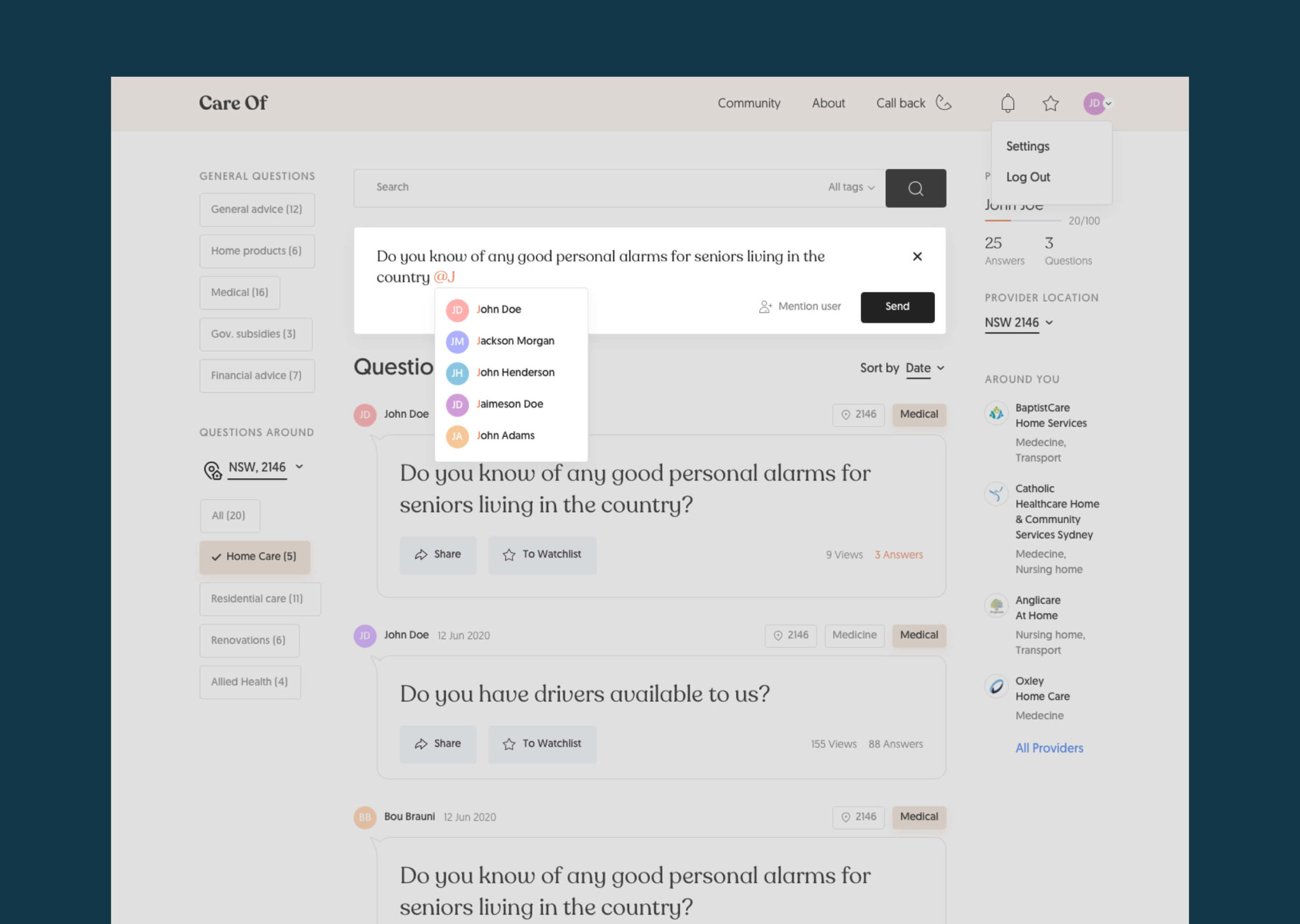
Admin – is a representative of website owner. Admin is adding and moderating content.
Research Findings.
Going through the channel where the relevant audience leaves honest feedbacks is always a great source of user insights. Luckily, we had a Facebook group where seniors and their family members share pain points, insights and questions to the community.
These were the biggest findings:
- It’s very hard to find the info which care providers are trustful as people do not share it with others. Some providers are abusing seniors and patients do not have an opportunity to impact and to be heard.
- Government websites such as myagedcare.gov.au and health.gov.au are hard to use for finding information.
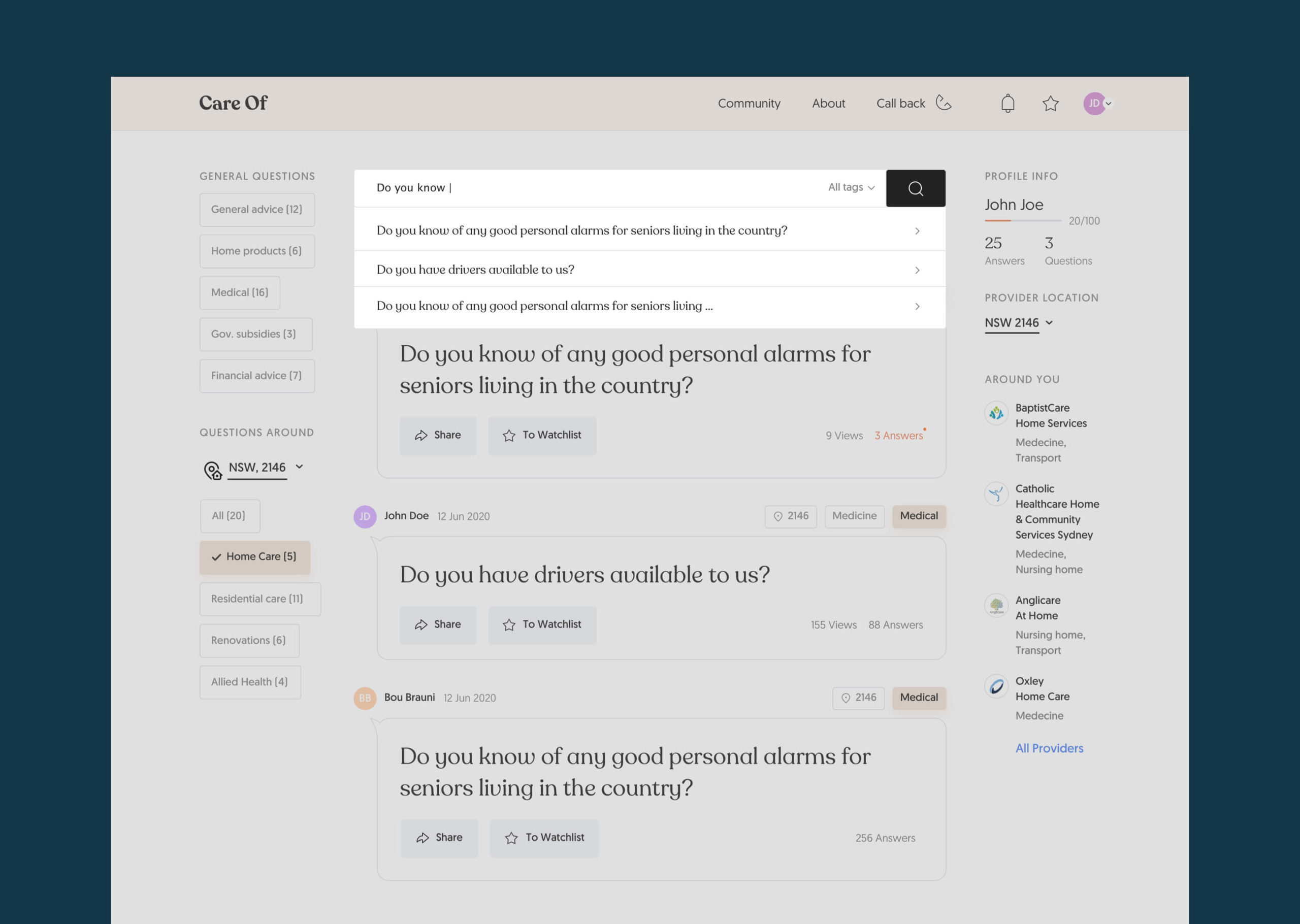
- Seniors are familiar actively using Facebook and the platform should be based on its UX.
- People tend to post either very good or extremely bad reviews.
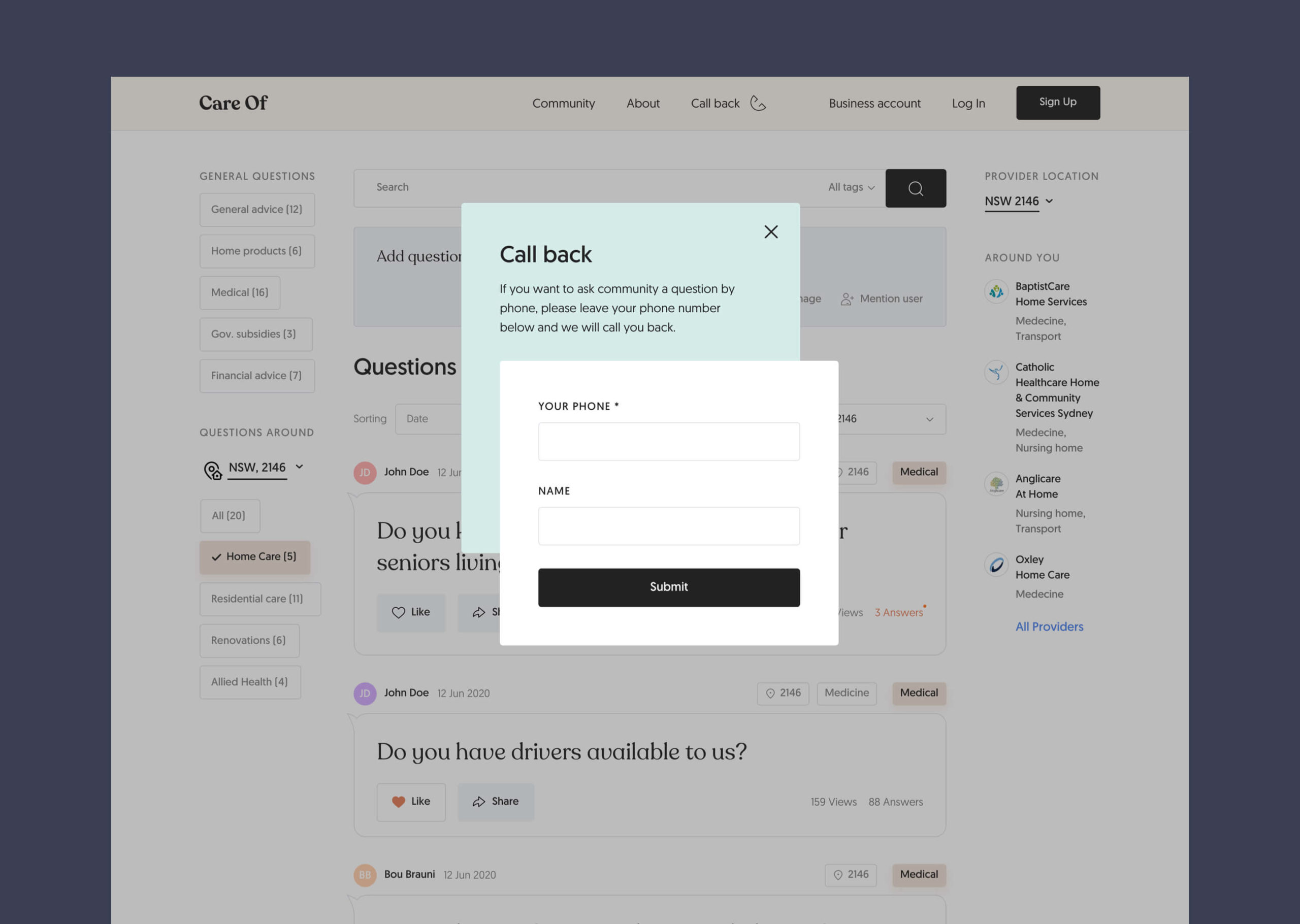
- Many seniors prefer a phone call versus online applications.
- Seniors want to know how to stay home longer.

Accessibility
Designing for ageing community brings a huge responsibility, and Web Accessability principles should be takein into account. I followed these rules requirements – www.w3.org/WAI/older-users
Shortly:
- Many older people require large text due to declining vision, including text in form fields and other controls.
- Avoiding chunks of italic text (future link)
- A contrast ratio of at least 4.5:1 for the visual presentation of text and images
- Some older people use text-to-speech (speech synthesis) software. A text alternative that serves the equivalent purpose” is required
- No CAPTCHA
- Make links visually distinct
- Navigation: web pages have titles that describe topic or purpose, display the user’s location on the website, provide search, navigation is presented in the same relative order across a website.
- Highlight a link or control when the mouse hovers over it
- The content is operable through a keyboard interface
- Some older people experiencing cognitive decline can be confused or distracted by pop-ups
- Providing a mechanism to request an update of the content instead of updating automatically (No Autosave)
- Providing spell checking and suggestions for text input
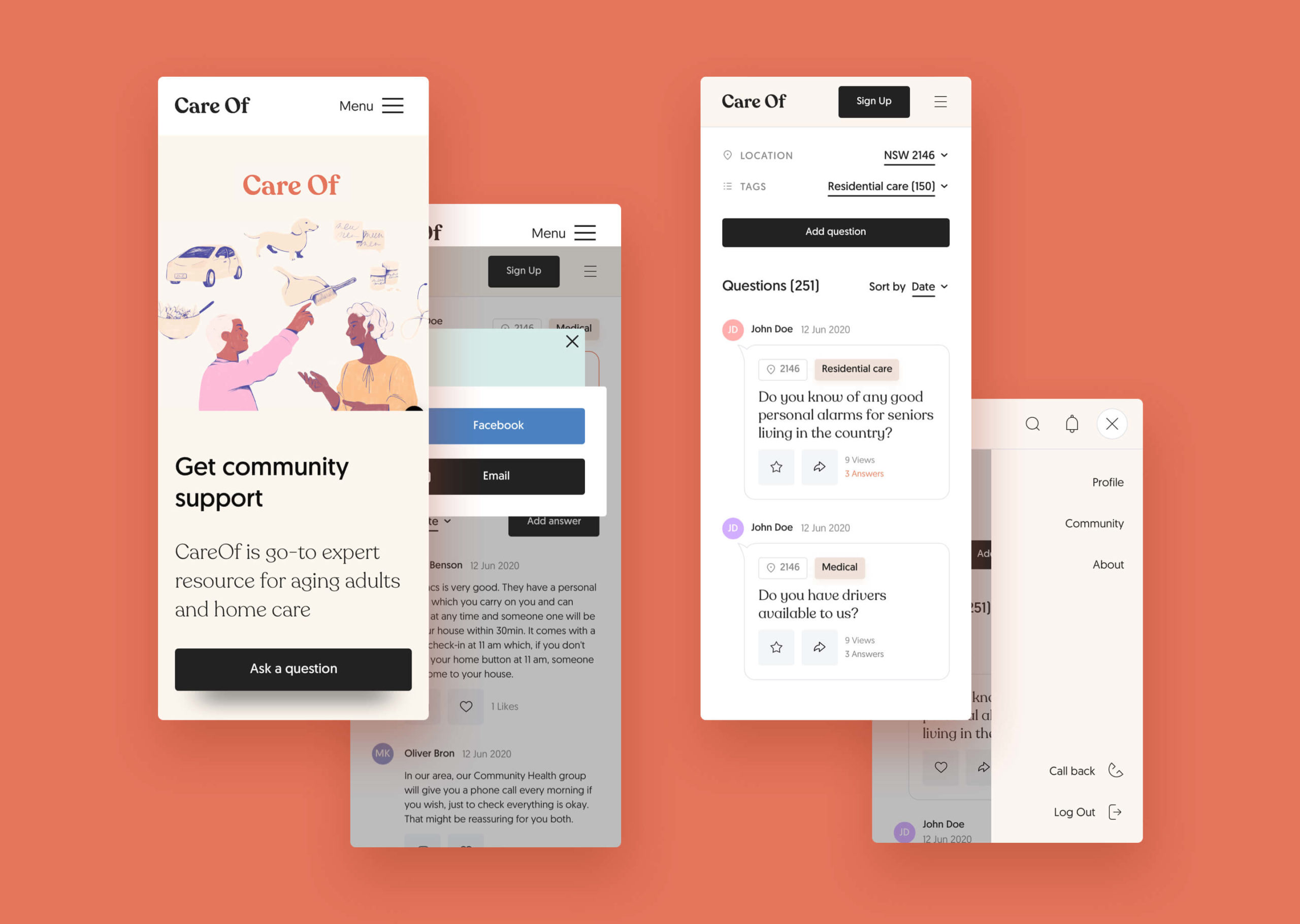
User Flow
Solid user stories perfectly transition into user flow.
On this stage it become clearly visible how many differences unregistered and registered user have. Check the live version here

Wireframing
I reraley skip designing in lo-fi wireframes as this tool enables see future UI in minutes and iterate much faster until everything seems reasonable and convinient to use.
Check the wireframes here at whimsical.com

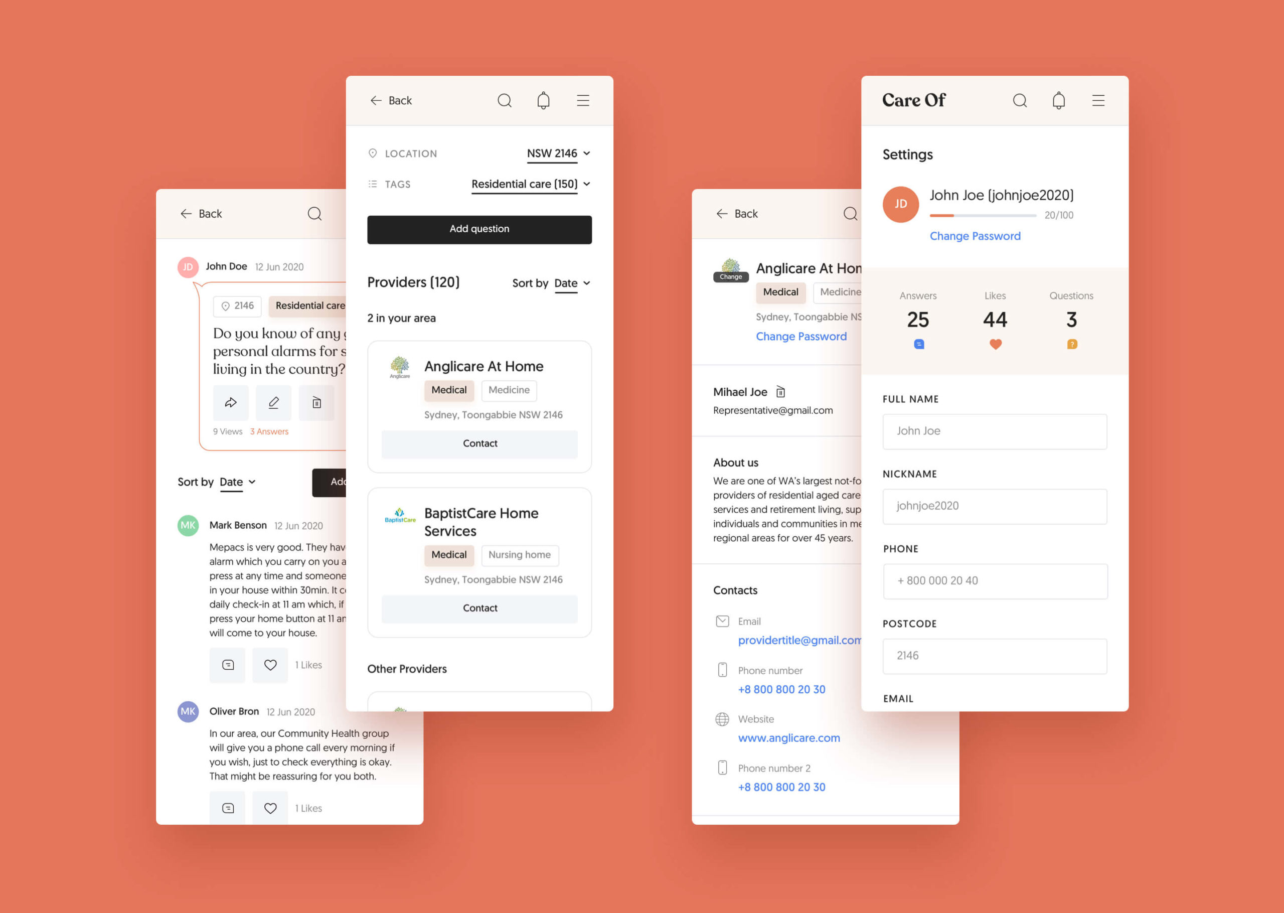
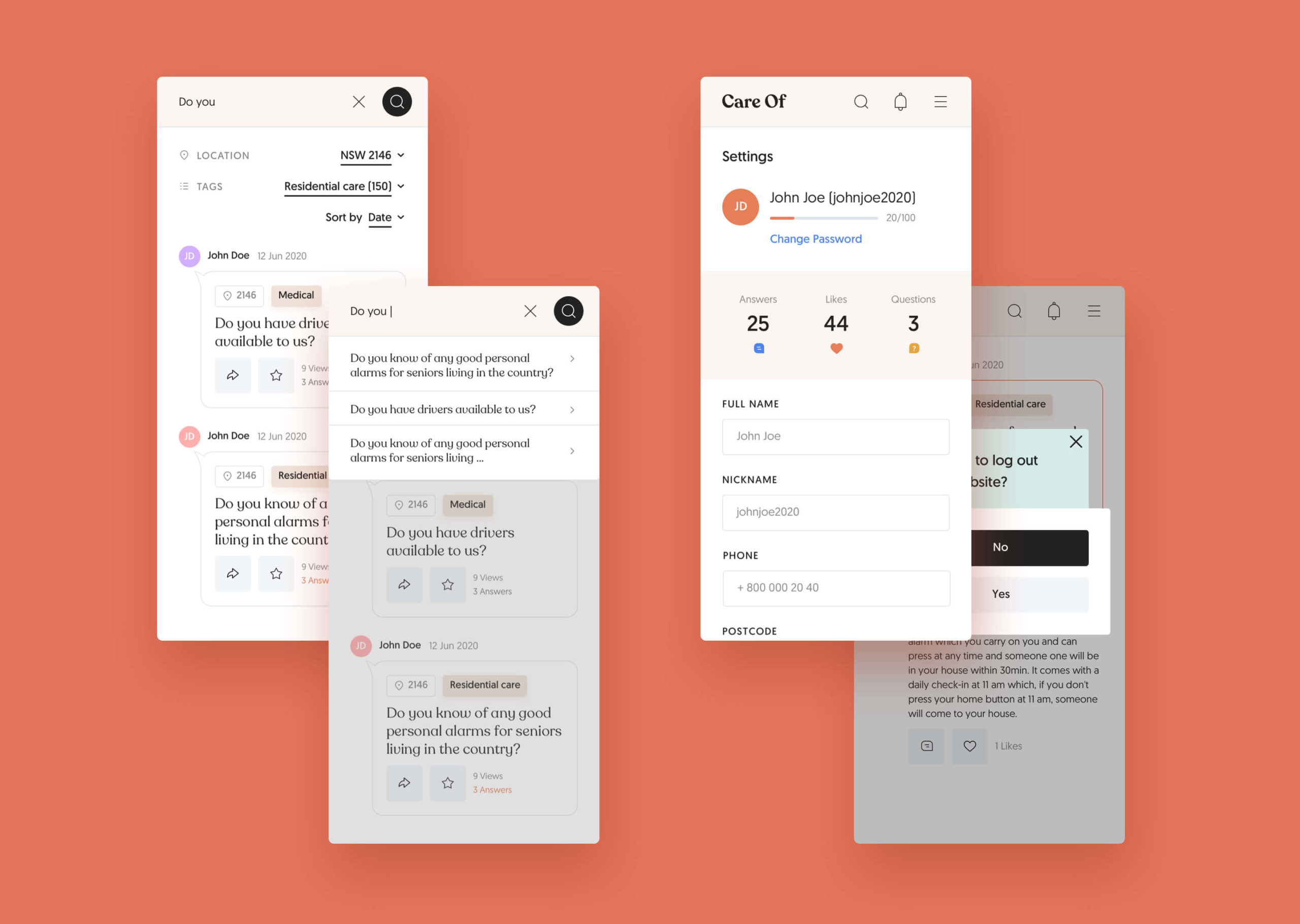
Hight Fidelity Mockups
User evaluation
It was challenging to proceed with a moderated remote testing for this target groop, as handling it requres some computer knowledge. Nevertheless, after a few attempts the testing with 2 ladies was done.
Hypothesis:
New CareOf website is accessible and easy to use tool for seniors and their relatives to get answers on ageing questions.
Tools:
Skype, Web camera, Mic
Session’s length:
30-40 min
Participants:
Min 2 persons, age 55+
Prototype:
Scenario:
- Getting into a mood, the questions regarding ageing and their experience with home care providers
- Start on the landing page
- Going onto Community pages
- Asking interviewee to perform certain actions, e.g. answer, search, navigate, register
- Asking follow-up questions for any struggles noticed.
- Wrapping up. Asking not only for the biggest struggles but also things they liked


Improvements
- Fix problems on a landing page. Get it rid of a current graphic. Find better copy.
- Locaiton selection on a community page needs to be simpler.
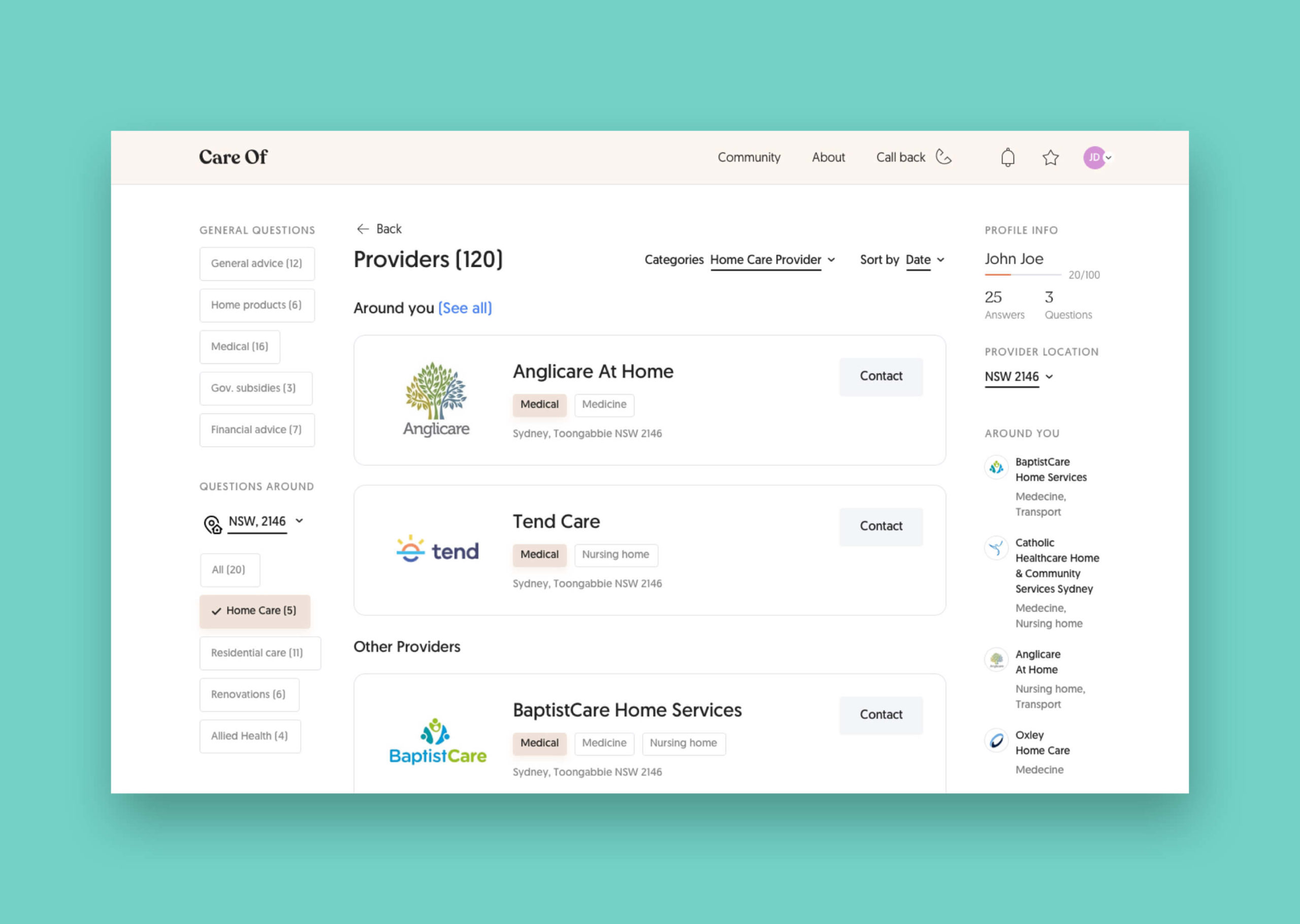
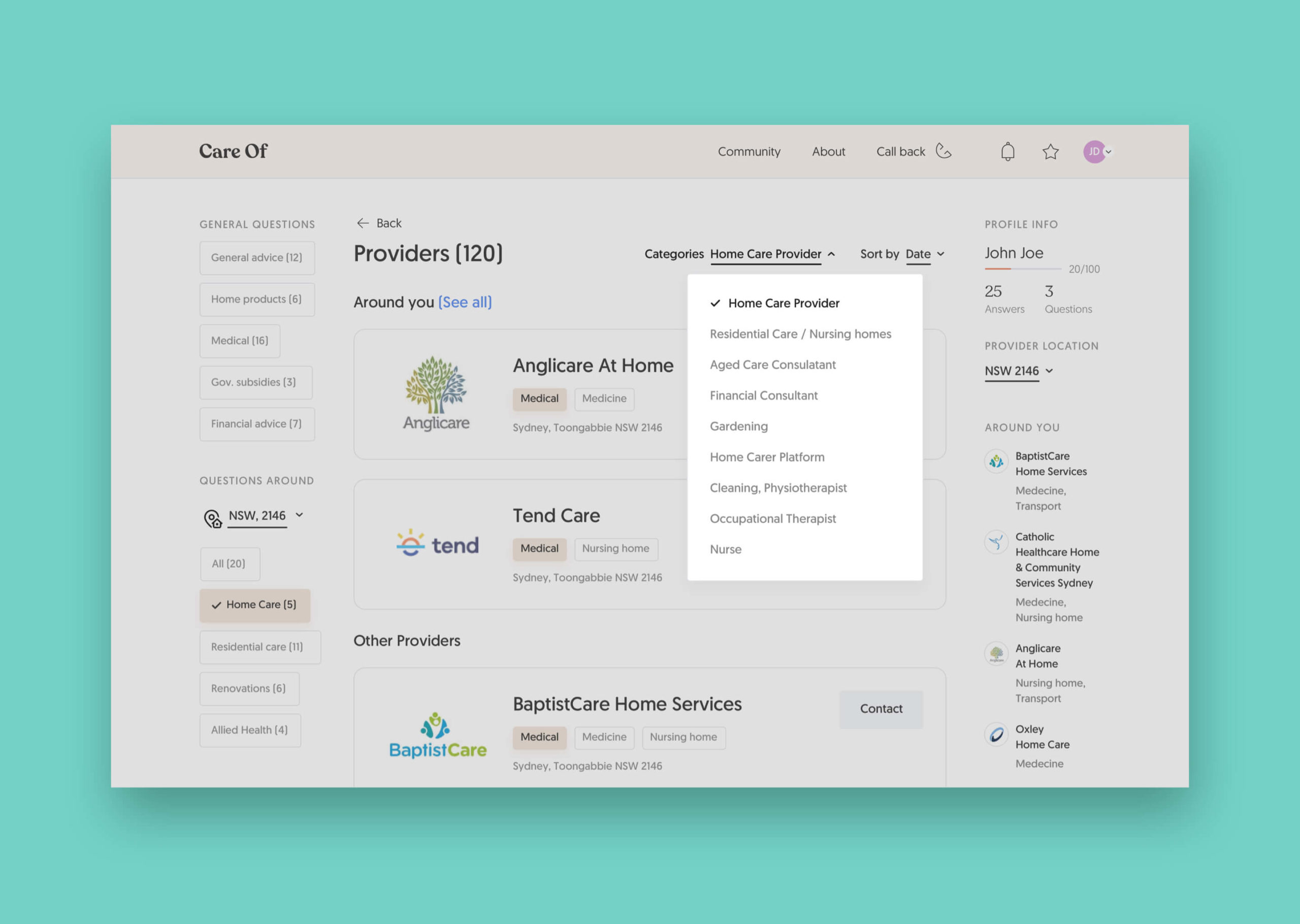
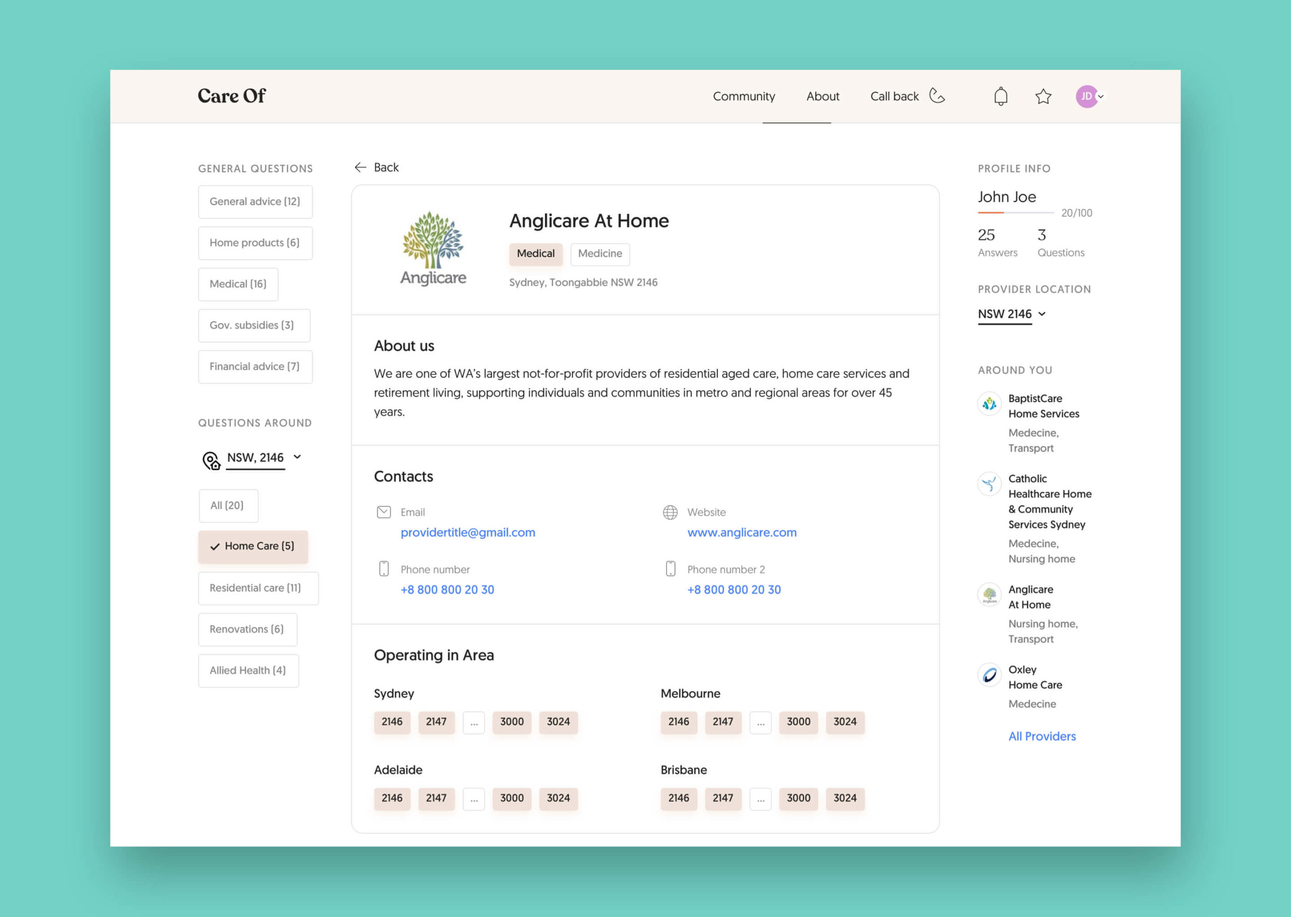
- Add extra fields to the “Provider” page: facilities, animal allowance, etc.
- Rename “Tags” into “Categories”.
- “Nursing home” rename into “Residential care”.

Final word
The project was launched in May 2020 at careof.com.au an running successfully. Unfotunately, not every page looks exactly as it was designed, but, the most important is that user and business needs are satisfied 😊